
Quick View
For three years, I led the UX and UI design for NeverEatAlone, a social dining web-app for hosting and discovering events. End to end, I defined user groups and their needs, organized product roadmaps and milestones, and handled every design deliverable from early ideation to development handoff.
Having worn every hat—from prioritizing design tasks strategically to crafting responsive, scalable asset libraries—my time working on NeverEatAlone matured my design process and encouraged me to step into the role of a senior designer.
Read on for a more in-depth breakdown.
Design Workshops & Information Architecture
My design process always begins with domain exploration and problem framing: whose pain points are we designing solutions for, and what business objectives should those solutions achieve?
To ground each product iteration in both user empathy and strategy, I planned and facilitated company-wide design workshops at the start of every cycle. These sessions brought leadership, development, and design together to align on our values, user needs, and MVP scope. I used design thinking methodologies like ideation sprints, persona development, and affinity mapping to frame our discussions and encourage multifaceted thinking.

A company-wide Figjam workshop I ran generated some thought-provoking personas, values and features.

Sample results of a rapid wireframing session I ran for our design team.

Sample of a system map for our B2B-side MVP, showing high-level information architecture.

Sample of a system map for our B2C-side MVP, showing both low-level information architecture and user flow.
Following each session, I independently organized key insights and used them to build actionable information architecture—from high-level system maps to detailed user journey flows. These deliverables became the blueprint for the ensuing round of design and development.
Design Library—Creating Scalable & Universal Components
To ensure consistency across design and development, all of our design assets lived in a Figma design library. I was responsible for
With a small team, we were highly iterative and collaborative, and needed a strong way to meld design and development. I used our design library to bridge this gap. It was a source of building blocks for design, and a specifications sheet for development.
Since design was often working one version ahead of development, I also handled version control and maintained a separate library for each subsequent version. This helped ensure that our design updates remained distinct between versions, while keeping the core brand identity in sync.
Each design library contained states for all reusable components, such as buttons, input fields, dropdown menus, cards, and icons. This allowed us to insert components with predefined parameters into the design of each page, and kept components shared between design and development.
I created each component to comply with accessibility standards, considering proper contrast ratios, keyboard navigation, and focus states.
If static components were the broad strokes in our process, then micro-interactions were the polish. I took the initiative to define transitions between component states—such as hover, on-click, and focus—and document the specifications of each interaction. I also wanted to give development a feel for these transitions, so I included mini-prototypes to bring each interaction to life.
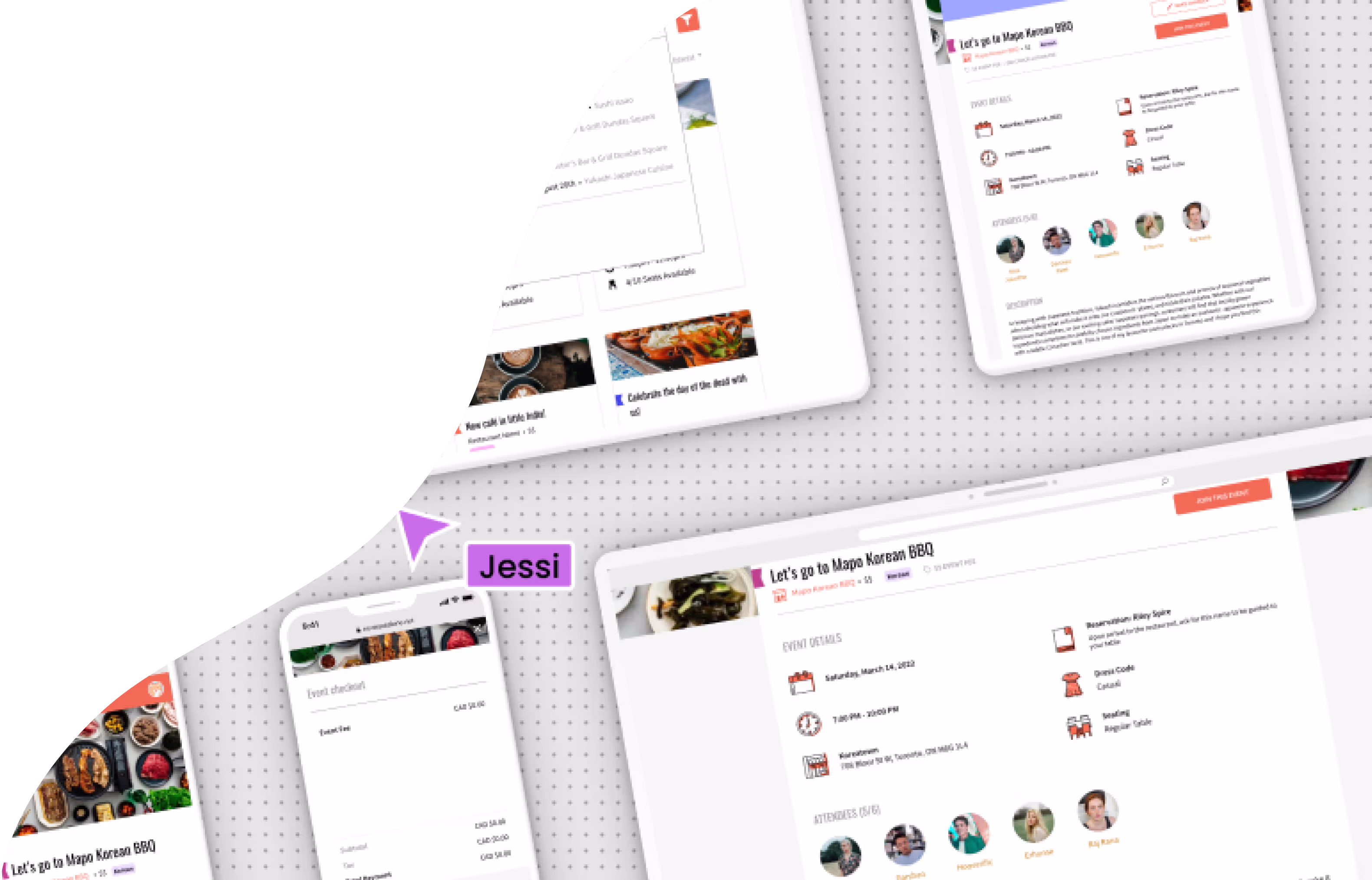
Wireframing & UI Design
Using the components from the design library, I was able to iterate quickly on high-fidelity wireframes. Without the need to push pixels, the UI design process was focused on creating fluid user experiences for each page and each page-component.
Prototyping & Design Handoff
As we were a small team working on NeverEatAlone, I focused on making functional prototypes that could be referred to during the development process, as well as creating graphical wireframe flows.
Here is an interactive prototype I created to demo NeverEatAlone. Click around, and try treating it like a live app!
View Prototype


